Our top-tier consultancy services provide strategic guidance to elevate your entire digital presence.
Learn More
Contents
Summary
Every website should have a unique layout that describes its navigation pattern to visitors. Otherwise, they might get confused and abandon it. To reduce the bounce rate and improve conversions, creating a user-friendly website is a must.
Here, we have unpacked a list of tips that can make your website visit worthy and inspire many.
Introduction
The website has no longer remained a side tool for generating income. From big enterprises to startups to multinational corporations, companies today are hiring highly skilled SEO specialists and web developers to leverage the power of digitization.
With the constant updates and changes in Google’s algorithm, creating a user-friendly website that captivates user interest and anchors your digital marketing efforts toward revenue generation has become quintessential.
Here are some benchmark tips that will be quite efficient while creating a website. But before that, let’s understand what a user-friendly webpage means.
What is a User-Friendly Website?
Have you ever abandoned a website after you couldn’t find what you were searching for? A good design with well-written content can reduce the bounce rate and help your users find information easily.
Its sole purpose is to create an engaging user experience. Such websites remove the hindrances and let visitors consume information diligently. The better the usability experience, the higher the chances of getting ranked.
10 Essential Tips that Will Aid in Building a User-Engaging Webpage
Here you go with some very important advice, which, when applied, will increase the website’s overall performance.
Page Speed
Consider this analogy: you are a shopkeeper, and a customer is waiting for you to open the shop. After a specific time, will he stay or leave? The same happens with a website. The bound Rate is equivalent to the loading time. Make sure the page loads quickly so that the audience stays instead of leaving the site.
Here’s how you can do it :
- Run Google Page Speed Tests. It will diagnose your performance issues, including contentful paint, speed index, etc.
- You can compress your images and videos before loading them, or you can install an image compressor that will dramatically speed up your webpage on its own.
Make an attractive call-to-action (CTA) button
Your customers are accustomed to standard visual cues to determine your CTA. So, ensure you mark it clearly within the website, not leading the users to get confused and leave it out of despair.
Here’s how you can do it :
- While creating buttons, ensure that you study human-mind color psychology. Recent research further validates it. A company named Hey achieved 11% more clicks in the checkout area by testing different color combinations and action psychology.
- Stuff the box with the right action verbs that excite the users, namely, learn more, form submission, sign up, buy now, subscribe, get started, etc. These prompts will guide the users to move forward with the purchase or learn more about your offerings.
Mobile-First Website
The internet has no longer been driven by static web pages. The dynamic, responsive website has already taken the reins.
With 61.21% of traffic coming from mobile, it has become a no-brainer to rank your desktop website optimally in the eyes of Google. The mobile-first approach while designing the website helps identify the elements the site should possess.
Here’s how you can do it :
- Choose a responsive theme that works well with the desktop, mobile phone, and tab website builders
- Avoid adding huge chunks of content to the website, as it makes content difficult to understand. It should be short, sweet, and breezy.
Verify your Redirects
Frequent redirects can kill your website and punish you hard. It can squeeze your customers and delineate their experience. Hence, to remove these errors, you need to audit the website regularly.
Here’s how you can do it :
- To ensure a seamless experience, click on the free backlink checker tool. It provides insight into broken links on the site and broken links to the site.
- Another resource to improve the redirection on and to the website is to create a 404 page. This will transfer the users to the home page or the page they were looking at while the linked page is not available.
Give your website a consistent look and feel
Consistency is hard to maintain. It ought to be pervasive and must navigate the users in the right direction.
For example, while constructing two web pages, ensure they have similar button styles, elements shapes, designs, illustrations, photo choices, etc. Everything should be wrapped in a uniform theme to make the web page look coherent.
Here’s how you can do it :
- Do not use too many colored fonts or schemes. It will disavow the user’s experience and can create a chaotic look.
- The repeating elements like the header, footer, and sidebar should look uniform; otherwise, the users will look confused and lose trust in your website.
No matter what page your user is on, you should be committed to offering them a first-rate experience.
Web Forms
Creating web forms allows the targeted audience to buy the products seamlessly or otherwise helps the company collect data while they submit their contact number or email ID. This information is then utilized when any offers or discounts are being announced.
Also, by setting up controls, invaluable insights are eliminated from piling up in front of the team.
Here’s how you can do it :
- They need to be small and concise. This will have the audience put less effort, improving the conversion rate and making them feel less loaded.
- Design the form optimally, and try not to mention the fields that are optional or not mandatory. If you add it, clearly distinguish it with an asterisk mark or write ‘optional’ in front of it.
For the asterisk mark, add a hint at the end of the form explaining it because everyone won’t understand the nuances of it.
Headings should be demarcated
Whether it is about creating an SEO-optimized website or a user-friendly website, headings should be demarcated in the correct format so that you attract the right audience and your users can connect better.
Here’s how you can do it :
- Learn the hierarchy of the heading structure. Start with H1. It should be unique and descriptive, and the content should be concisely introduced.
- Add subheadings, dividing the website content into sections and subsections. Each subsection should contribute to the overall website design layout.
- Lastly, do not skip the heading levels. For example, after H1, do not jump to H4. It will dismantle the user’s experience and will look aesthetically unviable.
Hyperlink Differentiation
A hyperlink is a link that connects 2 pages. Say you are quoting a figure to enhance the quality of your article, and you link it to the source page to prove its authenticity.
You can do this in 2 ways: text hyperlinks and image hyperlinks.
- text hyperlink is when you highlight a text, and when clicked, the viewer is taken to another page.
- image hyperlink is when you add a link to an image, and when the user hovers over it, it shows some context as a mouse tip. When they click on the image, they are redirected to the destined page.
However, hyperlink differentiation is a must for the website.
To understand it better, you can test the links by removing color from the design and seeing where they stand. Also, when hyperlinking, think about the length. The longer the URL length, the easier it is to identify.
Here’s how you can do it :
- The most common practice is that, initially, the link is dark blue with an underline. It changes to dark purple once it is clicked. This benefits the users as they can differentiate between the visited and the yet-to-visit web pages. However, these are not standard colors, and you can change them as per your preference.
- There are many ways to use a hyperlink. One is that while citing a page, you can either highlight the institute that has mentioned the fact or you can hyperlink the numbers. For example: To check out our Black Friday sale, click here. ‘Click here’ is blue and underlined, and once clicked, it redirects the user to the purchase page.
Information Chunking
These days, the audience’s attention has decreased, and reading long paragraphs or texts is out of the question. To align with this, websites need to disintegrate the chunked information. You can create several subheadings to make it easier for the eyes.
Here’s how you can do it :
- Break your main content into different sub-sections that address common issues.
- Mark every section with bold headings and integrate keywords that succinctly define that section’s content.
- Limit the paragraph to one main idea. The opening line should state it and use short sentences. It makes your message clear and well-defined. This lets readers scan the information and digest it instead of making them gulp it.
Improve your overall site layout
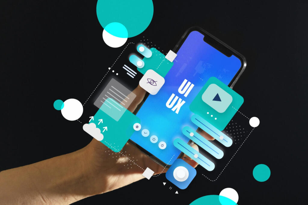
Obsolete websites do not rank highly. Search engines like Google are designed to only select up-to-date and quality websites for page indexing. The first step should be to revamp the website’s layout to make it more user-friendly. This means identifying the areas where the website needs to be changed. Reputed companies offering UI/UX Design services can extend best support in optimizing the overall site layout with their core expertise.
Study your website thoroughly. You need to find out the strengths, opportunities, and hindrances of the site, the target audience, market demand, etc. Knowing the site inside out lets you define your projects, objectives, and scope.
It helps to determine the further layout; for example, in a zig-zag layout, it directs the user’s vision horizontally across the screen. This layout works for storytelling websites or websites with graphic content.
Here’s how you can do it :
- You can use the F layout, which is practical for blogs, news sites, and online stores. As per theories, the surfers give more importance to the information mentioned on the top, upper left, and left sides of the screen most of the time, rarely glancing at the right side.
Applying this layout helps with quicker communication of messages to the target audience. - Follow the rule of thirds. It states that every web page should be further bifurcated into three sections, both vertically and horizontally. Following this guideline, the gridlines should be placed. It will help grab the visitor’s attention.
These are simple yet effective ways to improve the user-friendliness of the website. It will make it more accessible for different users.
Wrap Up
Building a website that is easy on the user’s end is all that a company needs to grow in the world of the internet. To have this done, a web page needs to be as simple as a breeze. The surfers should quickly get an assumption of the purpose of the site, how to proceed with any particular action, and most importantly, how to get in touch with customer service during times of crisis.
The above-listed considerations are some that every web developer should be acquainted with when it comes to usability and accessibility. Many people assume that a user-friendly website is a term that contains a lot of technical burdens. However, understand that this is a clear myth.
In this article, we have vividly described what a user-friendly website looks like so that you can identify the areas you can work on to create a lasting experience.


