Our top-tier consultancy services provide strategic guidance to elevate your entire digital presence.
Learn More
Contents
How Does Web Typography Enhance Website Interactivity?
As website and digital marketing professionals in Malaysia, matching web typography and colours is our daily routine. When it comes to design, we have to ensure that all our work is neat, readable, adheres to the client’s brand guidelines and, most importantly, aesthetically beautiful before sending them to the client. We try our best to ensure the designs are ready-to-go masterpieces and don’t look like rough drafts.
What Is Typography?
Typography is what sparks the text in your content to life.
Typography is the art of positioning and displaying the text in an appealing way that makes the content clear and, at the same time, readable for the audience. The typography consists of different styles and sizes of fonts, the overall appearance and structure that will ignite certain emotions and moods.
In this modern-day, typography is mainly associated with both the digital world and traditional print. As time passed, the digital world brought us a creative boon and an explosion in the art of typography. We are now bombarded with an abundance of font options and designs, making the current typography more visually innovative and diverse than ever.
Reasons Why Good Web Typography Is Important
1. Act As A Channel Of Good Communication
Typography acts as a platform for visual communication. Whether you’re operating a business website or a social media marketing campaign, typography adds character to your creations. The arrangement of the contents, the colour choices and the types of fonts used will determine the overall outcome of the communication between the owner of the website and the audience. With good typography, you can amplify a particular message in a clear and comprehensible way.
If the websites were predominantly image-based, the embedded typography needs to be strong enough to get noticed. Whereas for a text-heavy web page, you can take advantage of a good typography design to differentiate multiple sections and highlight important messages. Hence, you can get the crucial message across rapidly and effortlessly.
2. Brand Recognition
Typography works as an identification for the audience. Designated and consistent web typography will help you establish a wider audience’s reach online. This is because your targeted crowds had begun to relate to the typography featured on your official website. A constant pattern in fonts and colours adds great value to your brand. This consistency has built trust with the audiences that drive your brand forward.
You can easily visualize popular brands such as Coca-Cola and Disney at any place or time. Their unique typography imprinted vividly in our minds, helps create a feeling of familiarity between the brands and the consumers.
3. Highlight The Personality Of The Brand
Not only will good typography enhance your website’s recognition, but it will also indicate different types of personalities. Using typography can signify whether a company or a brand is playful, mysterious, youthful, feminine or masculine and so on. Thus, it is vital to understand your brand’s character and targeted audiences to utilize typography that delivers the right personality.
For example, rounded typography can be used to show playfulness and pleasantness. On the other hand, thin typography emits an air of elegance. With research and try-and-error, decide cautiously whether the typography of your choice is a good fit for your brand.
4. Make An Impact And Draw Attention
Good typography could determine the duration of your audience’s stay on your website. It greatly stimulates your website visually, making it eye-catching and memorable for your audiences. Accurately choosing colours and fonts will attract your target audiences with specific preferences.
The typography is essentially a work of art. You and your team can try and create or design some interesting typography by highlighting captivating content. Experiment and get creative with web typography to create a lasting effect on the online audience.
5. Convey A Certain Tone, Mood Or Feeling
Through typography on your website, a certain tone, mood and feeling can be easily conveyed and displayed. For instance, the tone and mood presented through typography in a gaming website should be fun and bright, respectively. In contrast, if your website content requires some seriousness, you should choose plain and professional fonts and colours. The choice of such typeface determines how the content is understood.
How the content on the website is understood depends on the choice of web typography you utilise. It brings out a brand’s core values without needing to overtly state what those values are. For instance, minimalism can be conveyed through modern and lightweight typography.
6. Reader-Friendly Due To Information Hierarchy
Information hierarchy can be defined as categorizing the information inside a webpage according to its significance. With different types of fonts and their sizes, you can differentiate the content that is most important from those with the least importance. For example, you can highlight the main topics using a larger font. This can ensure the audiences can easily spot the key information they should pay more attention to.
In text-heavy content such as a newspaper or brochure, we accomplish the information hierarchy via headlines that stand out and draw attention. This is because they are significantly larger than the rest of the content or body text.
7. Create Harmony And Easy To Read
Harmony is the leading trait in typography design. Besides providing an artistic effect, the repetition of the same font throughout the webpage creates a professional and streamlined look.
Harmonic typography design brings visual balance as the alignment of fonts with the correct proportion will help unclutter your content on the webpage, making it aesthetically appealing and easier for audiences to read or digest.
It is time to dive deep into some key features of web typography, which you can practice to achieve the benefits discussed earlier and get the best out of typography. The features will be discussed with the help of some of the previous works we are proud of.
8. Thick vs Thin Fonts
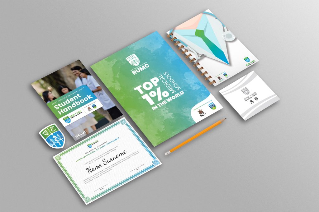
We recently revamped the website for our client, RUMC. It is a website for medical university students and parents to get more information about their courses. They chose Poppins as the typeface for their brand. It is modern, clean and can create a minimal design.
Poppins come in many weights. We need to make sure the weights we use throughout the websites are readable and, at the same time, don’t make the website look too cramped.
 Poppins SemiBold & Poppins Regular
 Poppins Regular & Poppins Light
We went live with the Poppins Regular & Poppins Light combination because the other combination looks too heavy. The lighter font feels cleaner and easier on the eyes when we read.
9. What Is The Right Line-Height For Websites?
Another thing I would like to highlight is the space between each line. When we are building text-heavy websites, it is crucial to set the right line height for the content. It will affect the reader’s mood. We went live with the Poppins Regular & Poppins Light combination because the other combination looks too heavy. The lighter font feels cleaner and easier on the eyes when we read.
Here are some examples from one of the blogs we have written for our client, Saffron Store.
 KODE’s Choice – Line-height: 1.6
 Line-height: 2
 Line-height: 1
We set the line height to 1.6 on this website. 1 is too cramped, and the readers will eventually give up reading after a few lines. Even though 2 is nice to read, it will make the website too long, and the readers will need to keep scrolling while reading to reach the end. Personally, I like to set between 1.2 – 1.6, depending on the amount of text on the website and the font we use.
How To Pick The Right Font Combinations?
For a parenting blog and e-commerce website that sells educational materials like Dumond Education, we don’t want the typography to be too formal. We think it should be more of a fun combination of the font to express a fun and lively mood when visitors visit the website.
 Heading font: Chicken Pie, Paragraph font: Century Gothic
 Heading font: Century Gothic, Paragraph font: Century Gothic
We have used Chicken Pie as the heading and Century Gothic for the content to enhance the brand. We avoided using just one font throughout the entire website. Don’t you think it would look like a template design?
We cater our website designs according to our client’s brand and will leave an impression on its visitors.
What Is The Right Font Size For Your Website?
When designing a website, we want to have a balance between the font size and the amount of space we have throughout the website. If we make the font size too big, not only will it take up more space, but it will also be hard to read because it will increase the lines you need to read and your eyes will need to keep shifting back and forth.
 Normal font size
 Large font size
Let’s take the LPR website as an example. If we had made the font size too big, it would have broken the heading and paragraphs into more lines. Even though it doesn’t affect scrolling, the text will take up too much space, and it will not be aesthetically nice to look at. The text content will not look balanced because the heading will look too huge.
Having larger text doesn’t mean it’s more readable. Sometimes it strains the readers’ eyes more when you give them too many lines to read.
Cater Your Website To Dyslexics
Not many people know about this, but we have learnt recently when building a website for a new client, Posity, that people with dyslexia have difficulty in reading. We can help people with this reading disorder to be able to read better by giving them the option to switch to the dyslexic font. The Dyslexic font is a unique typeface that uses thicker lines in some parts of the letters and is slightly slanted.
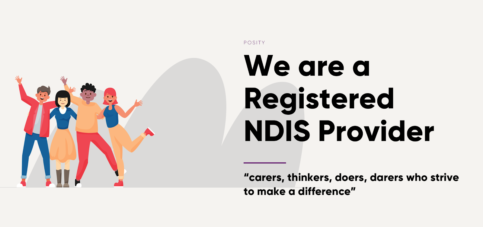 Font: Lato
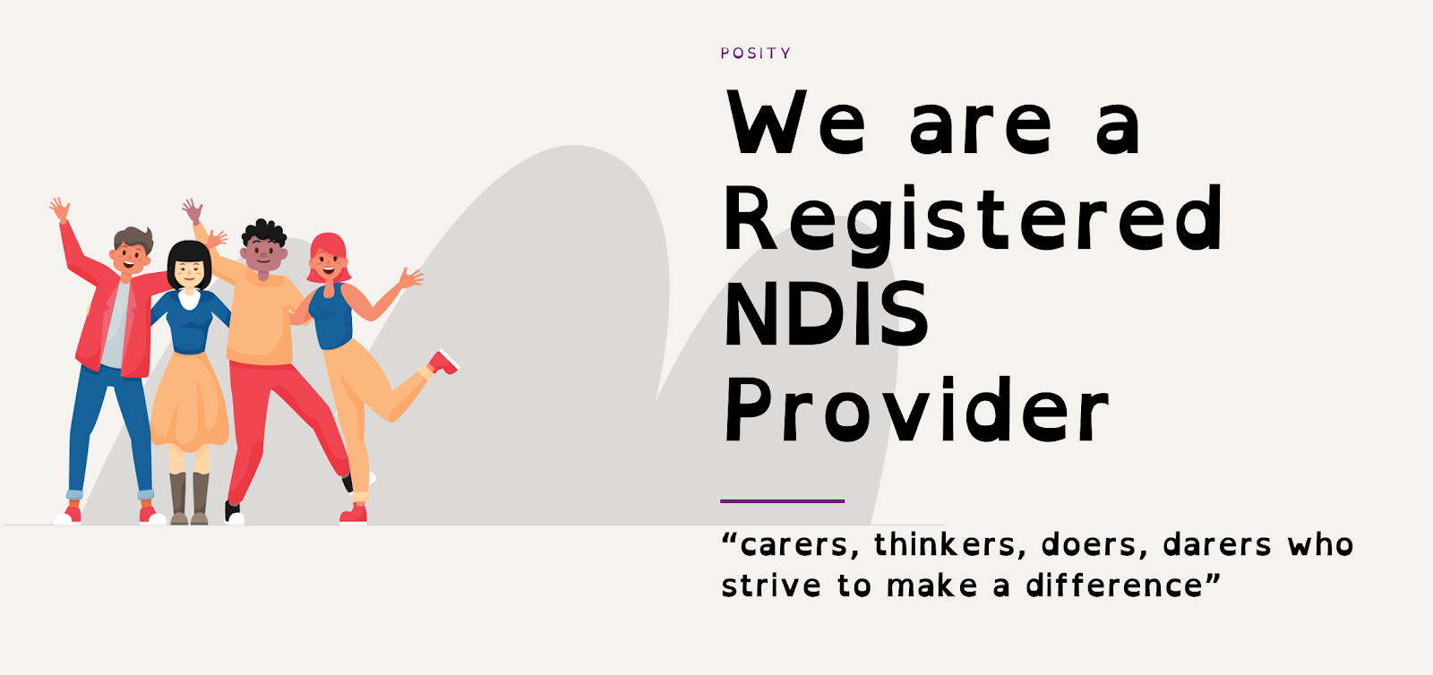 Font: Open Dyslexic
When we have website visitors with special needs, we must always be aware of the font and the colours we use. We can’t have too little contrast between the text and the background. It can be very challenging for some people. The text should also be big enough to cater to people with low vision or vision impairment. Better yet, you can provide them with an option to increase the font size for the entire website.
Every Website Is Different
You can’t use the same typeface for every website. Every website is catered for different target audiences, and it needs to have its own identity. Read about the differences between template design vs custom design websites.
Before you design the website, make sure you identify its target audience and purpose of the website. Make sure you go through all the content first and break content into different sections when needed to ensure that the web page is not too overwhelming.
Nowadays, many online tools help make matching fonts a lot easier. You can refer to my list below to pick the right font for your next website:
- https://www.fontsquirrel.com/matcherator – Identify font from an image
- https://fontpair.co – Pair the font you pick with another font that will go well together
- https://fonts.google.com – Use Google font without downloading and installing them to your website folder
- https://uicookies.com/css-text-effects/ – CSS text animation
- https://opendyslexic.org – Download Dyslexia font
Additionally, if you’re struggling with website content that doesn’t engage your readers, a professional essay writer from StudyCrumb can help you craft quality articles that cater to your audience and fit your website’s brand. Their proficiency in researching and writing on different topics and their keen eye for detail can help you create a more readable website that attracts and retains readers.
Feeling inspired? Reach out to us and let us find out which web typography suits your brand the most. It is time to bring your brand to a new high with typography, and, most importantly, our digital expert.
Verified Meta Business Partner
Kode Digital is more than just a creative digital agency, we are also a Meta Business Partner. As a Meta Business Partner, Kode Digital has access to exclusive tools and resources that can help our clients get the most out of Meta’s platforms. Our team stays up-to-date on the latest marketing trends and best practices, including popular marketing formats like TikTok Video Content. Our goal is to elevate your brand and help to grow your business.
Tailoring your website’s readability to your target audience is crucial for effective communication.
At Kode Digital, we specialize in website design in Malaysia, crafting ecommerce websites and ensuring top-notch website maintenance. With our expertise in mobile-friendly website development, we ensure your site ranks among the top 10 websites in Malaysia
Ready to launch your website development project? Let’s get started with Kode Digital!












 KODE’s Choice – Line-height: 1.6
 Line-height: 2
 Line-height: 1