Our top-tier consultancy services provide strategic guidance to elevate your entire digital presence.
Learn More
Contents
In 2020, every private and public business in the world was talking about digital transformation. Businesses that did not adapt to this new marketing platform lost money as a result. Government sectors have also allocated a large portion of the countries’ budget to aid businesses with the transformation. In Malaysia, the government has worked with Malaysia Digital Economy Corporation (MDEC) to introduce MDEC SME Digitalisation Grant in the 2020 Budget as an initiative to encourage business owners to subscribe to digital services or website development services, by providing them with a 50% matching grant, up to RM5000. Because of this, business owners and senior management of companies have had a better understanding of what’s involved in the website development process from design to development to the launch of a website. At this stage, most businesses care more about the functionality of the website rather than its looks. As digital experts, we need to make sure all our work is usable and pleasant-looking to ensure our clients can maximise their revenue through the website. Here are the top 10 website design trends for 2024.
How Do I Keep Up with The Latest Website Design Trends?
As professional designers, we need to constantly keep ourselves up to date with the latest website design and digital trends around the world. These are some websites we usually visit to view the latest website design trends and get inspiration.
1. Landingfolio
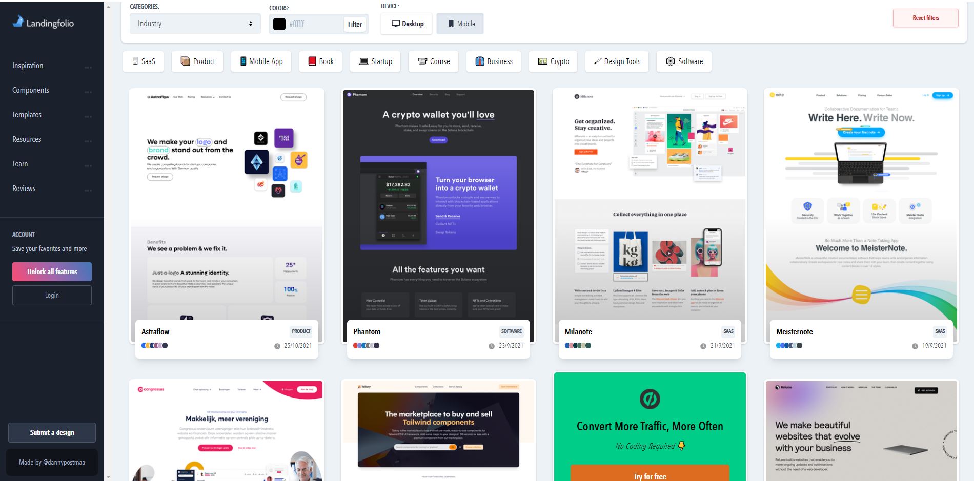
Landingfolio is a useful tool to get inspiration for landing page designs. There is a search tool that allows you to filter by categories and colours depending on the type of website you are building. In each search result, they also recommend the other colours that will match well with the colour you have picked during your search.
2. Httpster
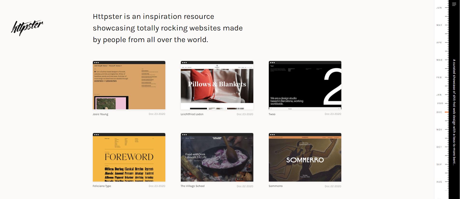
Httpster features website design and development work from all over the world. The less-is-more styles they feature are more suitable for artistic and modern industries. The work is sorted by the creation date so you can scroll further to view the older creations.
3. Awwwards
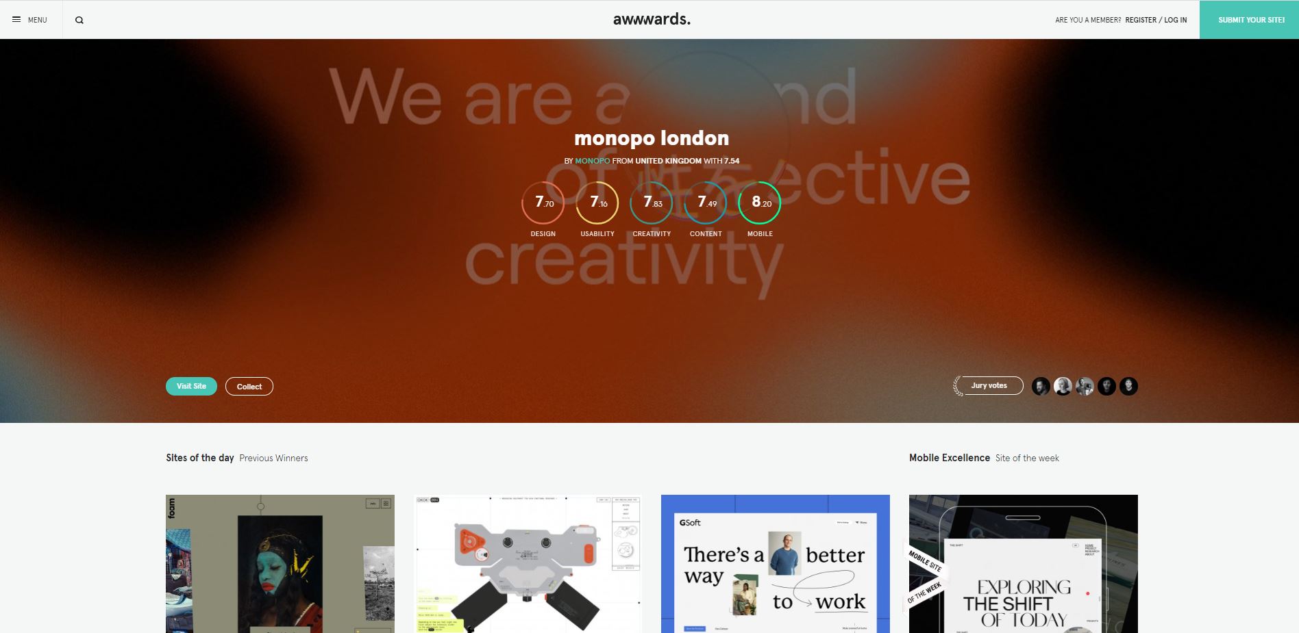
Awwwards is a good website to get inspiration for website effects and animations. By referring to this website, we can learn how award-winning designers play with typography, transition effects and 3D elements to make the websites more engaging to the users.
4. One Page Love
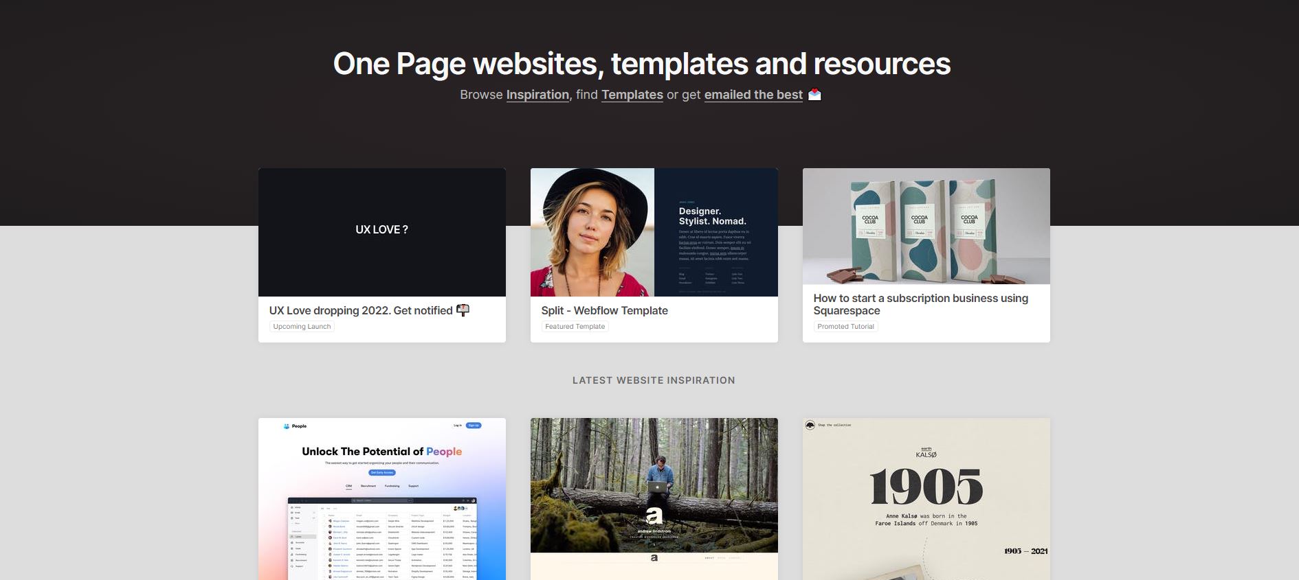
One Page Love is where you get ideas for your one-page website designs. When designing a website, you often need to fit a lot of information on a page. You will also need to split the content into a few sections to make it easier for the users to find information. In this website, you will be able to see how other website designers differentiate each section smoothly without affecting the aesthetic of the overall design.
What Are The Upcoming Website Design Trends for 2024?
After some digging, these are (in our humble opinion) 7 website design trends to keep an eye on in the coming year:
1. Dark Mode
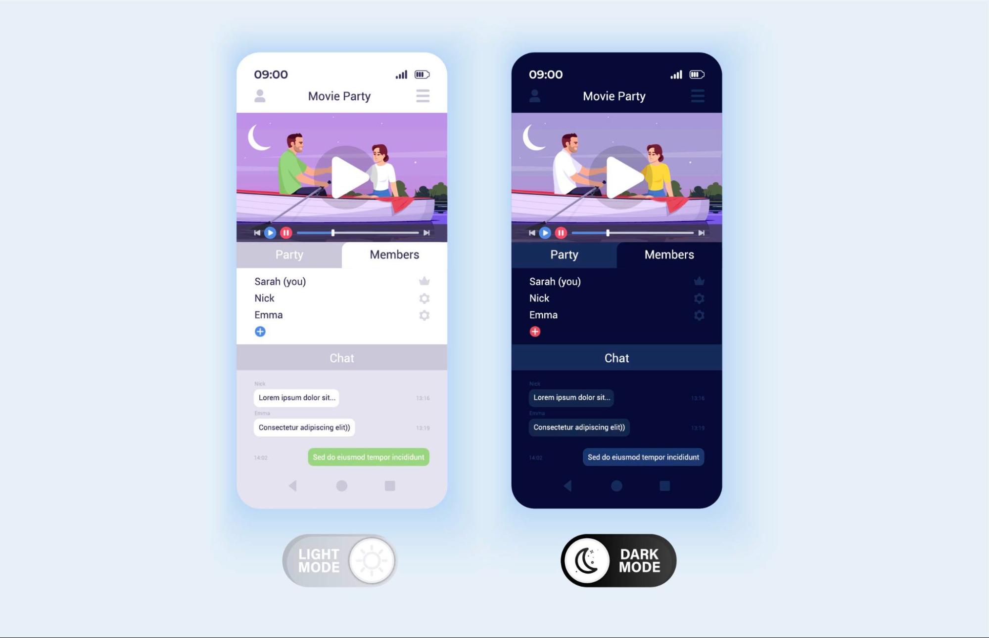
There has been a trend in the website and mobile app design to have dark coloured backgrounds and bright coloured text in recent years. Many famous mobile apps such as Meta and Instagram have introduced the option to switch to dark mode to cater to the users who like dark mode.
Things to be aware of:
- Minimalistic: Most dark mode designs use minimal design elements to prevent it from being too complex for the users to digest the information displayed. Try to create spaces between the text, button and design elements to make it comfortable for the users to browse through the website.
- Contrast: Make sure the texts are readable on a dark background. If using a midnight blue background, use bright colours like light yellow, pink or lime green. You can also use neon colours to give it a party effect. If you are using a matte background, then you can try metallic colours for the design elements and text.
- Font: Use a fairly bolder font to make it easier for website visitors to read. We have to prevent them from squinting and getting eye strain.
2. Parallax Scrolling
The parallax effect is an animation technique where the foreground elements move faster than the background elements, creating a 3D optical illusion. It has been possible to create this effect for a few years now, but 2024 is shaping up to be the year of parallax zoom scrolling.
Things to be aware of:
- Design: Creating a design for parallax scrolling is not like designing conventional or even modern graphics. It needs to be approached the same way one would design a pop-up book. Often, this will require some understanding of 3D design and animation, as well as plenty of design planning beforehand.
- Timing: When implementing parallax scrolling designs into webpages, something to keep in mind is how long it will take for web visitors to view the whole thing and how much space it will take up on the page. The best kind of parallax scrolling designs don’t take up too much space while still having an interesting design.
- Spacing: Designs for parallax scrolling make or break depending on their use of space. A design that is too cluttered will lose its effect, and one that is too spread out will seem empty. The key, then, is understanding how to create good optical illusions with depth perception.
3. Video Speaks a Thousand Words
In the past, we avoided having videos on websites because of slower servers. Nowadays, many web servers are catered for heavy use and can load fast even if you have 5 videos on a page. You can use videos to present your products and services. That way, your website visitors don’t have to browse very far in the website to understand what you are trying to sell to them.
Things to be aware of:
- Accessibility: There are still people who are not able to play videos on their devices. We need to make sure they can access the transcript of the video, or have similar information somewhere throughout the page.
- Lazy Load: If you are targeting international customers, or have your server located in another country, website loading speed might be an issue for you. You can make your website load faster by activating lazy load for your videos and images.
- SEO: Large website size will affect your SEO ranking. Generally, a home page should only weigh less than 2.5MB, but a website with a lot of videos and images usually weighs larger than 10MB. It will be harder for Google to crawl large files. Therefore, you should use MP4s instead of MOV and try to compress your video to the right size needed for a website. You definitely don’t need a cinema resolution for your website visitors. It is suggested to compress it to 1920px x 1080px to prevent it from being too large.
4. Increase Interaction with Animations
It is easy to design elements for the website but how do you ensure that your visitors will enjoy interacting with it? If there’s not a lot of budget for the project, you can consider adding cool transition effects for sliders or hover effects for some of the boxes and buttons. It will definitely enhance the user experience and catch more attention.
Things to be aware of:
- JS vs CSS: Try to avoid using JS Libraries and instead, animate with CSS. CSS is more lightweight compared to JS. Also, JS often requires external libraries and will affect the loading speed of the website.
- Less is more: It is recommended to have some animation to enhance user experience however, if you have too much animation on the website, it may disturb the usability.
- Timing: Control the timing for your animation. For example, it should not take more than 1 second to complete the hover effect for a CTA button. It should be quick so it can catch attention. If you are using sliders on your website, make sure there is enough time for the users to read all the information before transiting into the next slide.
5. Clean Typography

In the 2000s and 1990s, you may have seen websites that use fancy typography like Comic Sans Serif, cursive and futuristic font faces. However, from the mid-2010s until now, we have noticed that most designers prefer to go for a more clean and minimalistic look for the website. They often use fonts like Futura, Poppins, Source Sans etc. Some designers even manage to create interesting designs using a single font. The trick is to make use of different font sizes and thicknesses of the font face.
Things to be aware of:
- Readability: If you are playing with font sizes and thickness, it is very important to maintain the readability of the font. Invite a user with visual impairment to browse the website without eye strain.
- Be responsive: If you are using larger fonts for your headlines, make sure you adjust the size for mobile devices so you can at least have 1 word in 1 line. If not adjusted properly, sometimes you will see some longer words go out of the window, or break to a new line. It will be very challenging to understand the context if the headline is too long.
- Font pairing: Some designers like to pair different types of font, such as Sans serif & serif, cursive & sans serif. Make sure when you pair your font, they look natural and don’t look too messy. There are many tools to help you with font pairing like fontpair.co. By using this tool, you can get an idea of what your website will look like when using these fonts.
6. 3D Elements
In 2020, many websites have started to turn their stores, art galleries or events into virtual ones. The pandemic has prevented customers from visiting them so having a virtual site will be more convenient for visitors to pay them a visit without having to travel and practice social distancing at the same time.
Things to be aware of:
- Budget: When building a virtual space, it is very important to consider how complex you want your space to be. Do you need an actual 3D rendering? Do you want to use stock images or hire someone professional to build the space? Does it require any movement control using a mouse or keyboard? How many elements are there in the entire website? These are things you can take into consideration to prevent your project from going over budget.
- Speed: 3D elements can be very large in size and can affect the website loading speed. When the users need to take too long to navigate through the site, they will get angry and exit immediately.
- Accessibility & Usability: With very minimal text, would the users know how to navigate around the website? Do you need to force them to go through a ‘welcome’ page before they start using the virtual space so they get an idea of how to use the website?
7. Illustrations
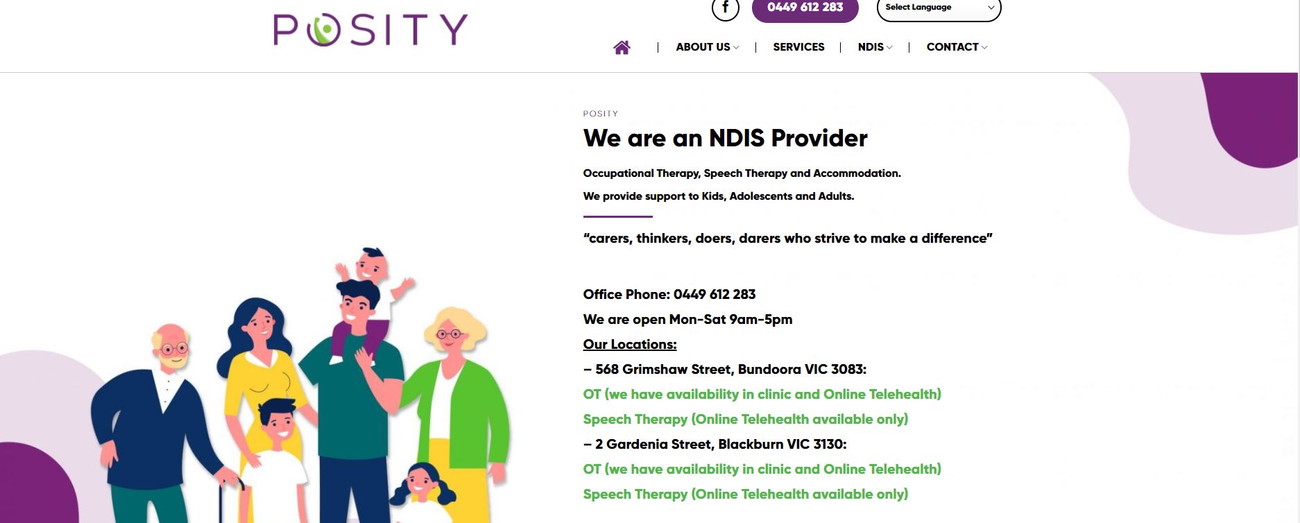
Stock photos are very widely used on websites because they are more affordable and do not require you to hire a professional photographer to get professional shoots. However, in 2024, we have noticed that designers are trying to move away from real photos. They prefer to use vectors and icons to present information. This is because these illustrations are more neutral and promote diversity. Some may think illustrations will make the website look too kiddish but if used correctly, the illustrations can also look luxurious.
Things to be aware of:
- Everyone has access to the same icons: Due to budget constraints, designers often use free icons that are easily accessible on the Internet. You can be a differentiator to the icons you use by changing them into your brand colours or adding some elements to make them more relevant to your industry etc.
- Standardise: When getting icons from different platforms, make sure the icons or vectors have the same thickness and similar feel, otherwise it will look too obvious that the illustrations come from all over the place.
- Credit the author: Some platforms require you to give credit to the original author. Even if you have modified the original illustration, make sure you credit the designer somewhere on the website.
Don’t Freeze, Don’t Stop, Don’t Worry That It Isn’t Good Enough, or It Isn’t Perfect, Whatever It Is.
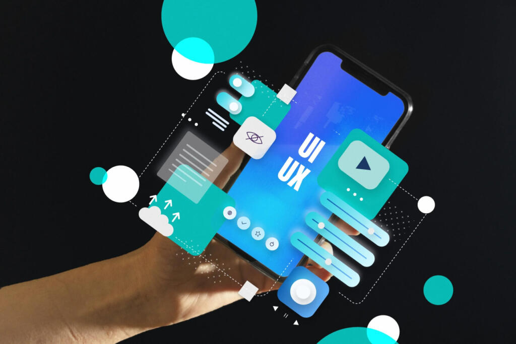
Using the above as your guideline, we hope you can get more inspiration for your upcoming website design project. However, there’s still much more to cover. So if you wish to delve deeper and get more first-hand ideas regarding UI and UX, I urge all keen readers to hop over to this site and explore more about it.


