Our top-tier consultancy services provide strategic guidance to elevate your entire digital presence.
Learn More
Contents
In today’s modern marketplace, in making purchasing decisions, do you still walk into stores, compare your products, and then purchase them? Instead, if you’re browsing the net for information to help you make smarter purchasing decisions, you’re a part of the vast majority – 87% of shoppers begin product searches online. If online is your go-to, it is most likely that your potential prospect would too, wouldn’t they? No matter which marketplace your potential prospects land on and discover your products or services, you would want to traffic them back to your business website.
The Importance of Business Website
Firstly, do you know the importance of having a website for your business? How can a website help your online business? A business website is the backbone of the online presence of your business. Moreover, the ultimate goal of your website is to answer your potential prospects with the information you have on your site. What’s more, your website is available 24/7! And with that, your potential prospects may conveniently visit your site anytime to learn about your products or services. On the other hand, by having a website, you can easily achieve various marketing strategies, earn more sales, and successfully grow your business. All you need to do is by advertising them via pay per click ads or social networking sites.
7 Essential Elements Of A Good Business Website
A quick question – would you consider a business with an unprofessional website design, a site that doesn’t include testimonials or an unclear idea of who they are and their products or services? Well, you wouldn’t. That’s because they don’t sound professional and credible, isn’t it? As a result, we couldn’t stress more the fact that having a good website can create a great first impression for your business. But what makes a good website? Here are 7 essential elements of a good business website for you to successfully attract potential prospects and convert them into sales.
1. Who are You? What Do You Do? What Makes Your Business Different?

As we’ve mentioned, the information on your site is the answer for your potential prospects. It’s an opportunity for your potential prospects to get to know and consider your business. They are definitely considering trusting you and your brand. So, make the best first impression on your ‘About Us’ page.
If you are not sure where to start, you can browse the websites of the big players in your industry and see how they do it. Most of the big players always spend a lot of money to refine their website copywriting to make their brand stand out more.
Avoid bragging and being pushy. Be straightforward about:
- Who are you?
- How long have you been in business?
- What are your products/services?
- What are the core values of your business?
- Do you have the number of satisfied customers worldwide?
- What makes your products/services different from the others?
Things to be aware of!
- Make sure you include more keywords about your industry. Target audiences will come across your website if you have the words they search for on search engines. For more information about SEO, read about our blog
- Branding is very important. Make sure you include an adequate amount of your brand name to remind people that they are on your website while reading about you.
- Include any statistics about your business or awards you have received that will make you stand out from your competitors. This will definitely help in boosting clients’ confidence in your business.
- If you are getting references from another website, make sure you paraphrase the content to avoid getting complaints from other content writers.
2. Responsive Web Design
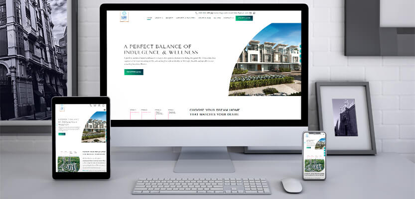
With today’s advanced technology of individuals on smartphones and tablets, you’re at a disadvantage if your website isn’t designed to respond to fit all screen resolutions. A responsive web design can positively impact user experience, increase mobile traffic, Search Engine Optimization (SEO), and conversion rates. An adjustable screen size provides your page visitors with a great user experience. Hence, it allows them to spend more time on your site, and build trust for a higher conversion rate.
In terms of SEO, did you know that responsive web design improves search engine rank? Google has been considering responsive websites as one of the ways to rank your website on the search engine result page.
Things to be aware of!
- Make sure the text are readable, even on mobile
- Make sure your text and website elements don’t go out of the screen
- Check if all the buttons and links are big enough and not too close to each other
- If you have a major functionality like accessibility or language translator, make sure it is visible to the user when they first load the website on their mobile device.
3. Social Media Icons & Sharing Buttons at the Right Places
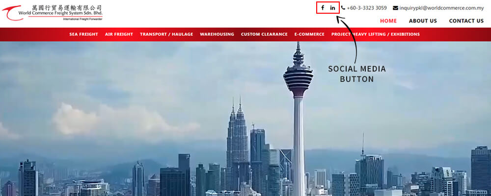

It takes effort to improve your social media presence in Malaysia. If you have been improving your online presence, you would have realized the hard work it takes to develop a successful presence on social media. So, why hide your social media and sharing buttons on your page where visitors could not easily see them? Add these buttons at the right places to attract new users and encourage the growth in shares.
The ideal place to add your social media buttons should be at the top half of your page. Thus, page visitors could view the buttons without having to scroll down the page.
Social media icons will lead your visitors to your social profiles. However, you should also be adding sharing buttons on your website to encourage your visitors to promote your content. Place the sharing buttons near to your to be shared content.
Nowadays, you can also add call and Whatsapp buttons to your website, together with a default enquiry message. That way, if you are selling products or services on your website, it will be easier to know which products/services your customer is referring to if they click the Whatsapp button from the particular page.
If you want to increase followers on your social media profile, you can consider adding your social media feed to your website. Place external links buttons on the home page or contact page and bring people straight to your social media feeds. Your customers who want to keep themselves updated with the latest news in your company can also follow your social media accounts once they look at your feed.
Things to be aware of!
- Make sure the button is visible
- Add different colours for the social media icons to make them stand out and easily recognizable
- At the time of development, the social media profiles might not be set up yet. Before the launch of the website, make sure you check that all the links are working. Also, double-check whether the call and Whatsapp buttons lead to the right phone number.
4. Contact Page & Call to Action
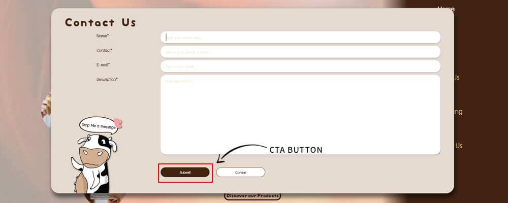
Now that your potential prospect has viewed your content, what is next? How are you going to get them to reach out to you? Be sure to have a contact page consisting of all your contact details such as phone number, email address or/and other relevant Call To Action (CTA) buttons such as ‘Shop’, ‘Sign Up’ to your marketing campaigns.
If you think static buttons are too boring, make your buttons more attractive by adding a gradient background, making them float or glow, or even creating popups to prompt them to sign up for your newsletter!
If you are running an eCommerce site, you can nurture your clients by sending them an auto follow up email if they have added products to the cart but have not checked out. Remind them that they are going to miss out on the promotion. You can also ask them if they have any issues or upsell them another product that they might be interested in.
Things to be aware of!
- Even though it is important to have more CTAs on your website, make sure it doesn’t make your website too hard to navigate. Sometimes too many call-to-actions on your website might confuse the users and they will need to spend a lot of time to find the thing they are looking for.
- Always check if the CTAs are the right size for mobile devices
5. Web Designs & Layout
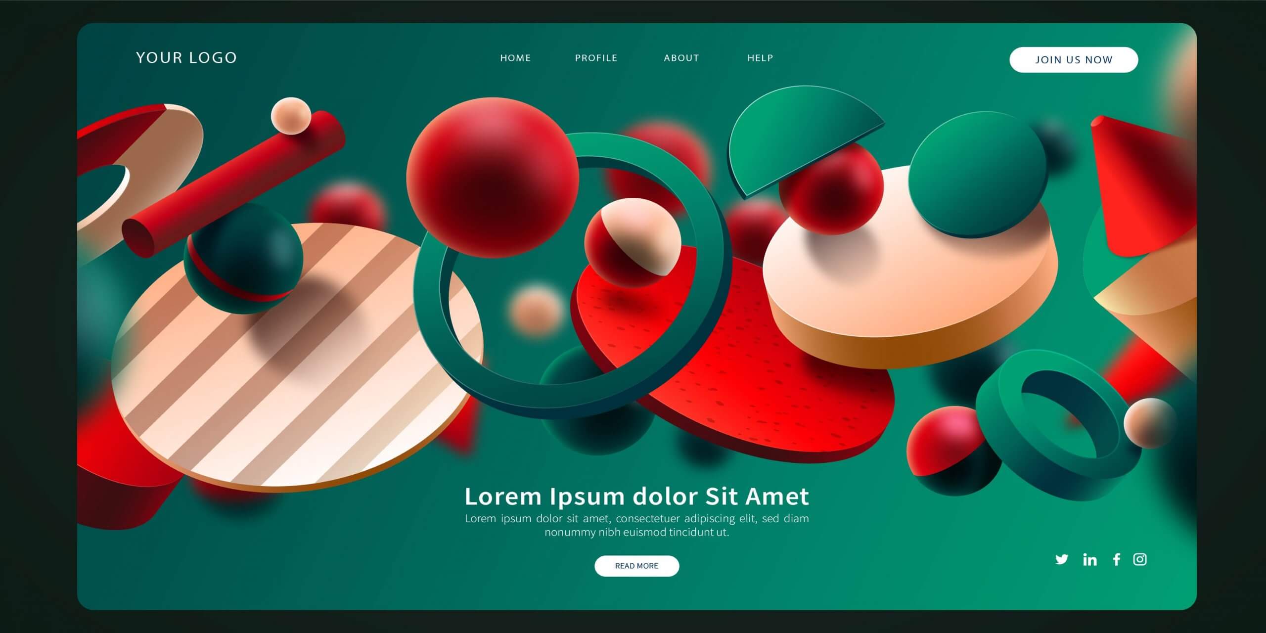
The first few seconds on your website would be how your potential prospect perceives your business. So, is your web design up-to-date and appealing to attract visitors to your website? Learn about the styles and elements of web designs every year. You may integrate the new elements into your site and improve the user experience.
Are you knowledgeable about the top UI/UX design trends that dominate 2020 and 2021? Some of the latest trends are immersive 3D elements, Dark Mode, a mix of photography with graphics, and bold fonts in UI/UX design. Kode Digital was actually nominated as Top 5 Web Designer in Penang, Malaysia by Trusted Malaysia. So, if you are ever in doubt, you can always check out our blogs or get in touch with us through our social media page for a free consultation.
Things to be aware of!
- Make sure the images are compressed to reduce the load time of the website
- Try to use minimal colours on your website to maintain your brand identity
- Make the colours, font sizes and font type consistent throughout the website
6. Testimonials and Case Studies
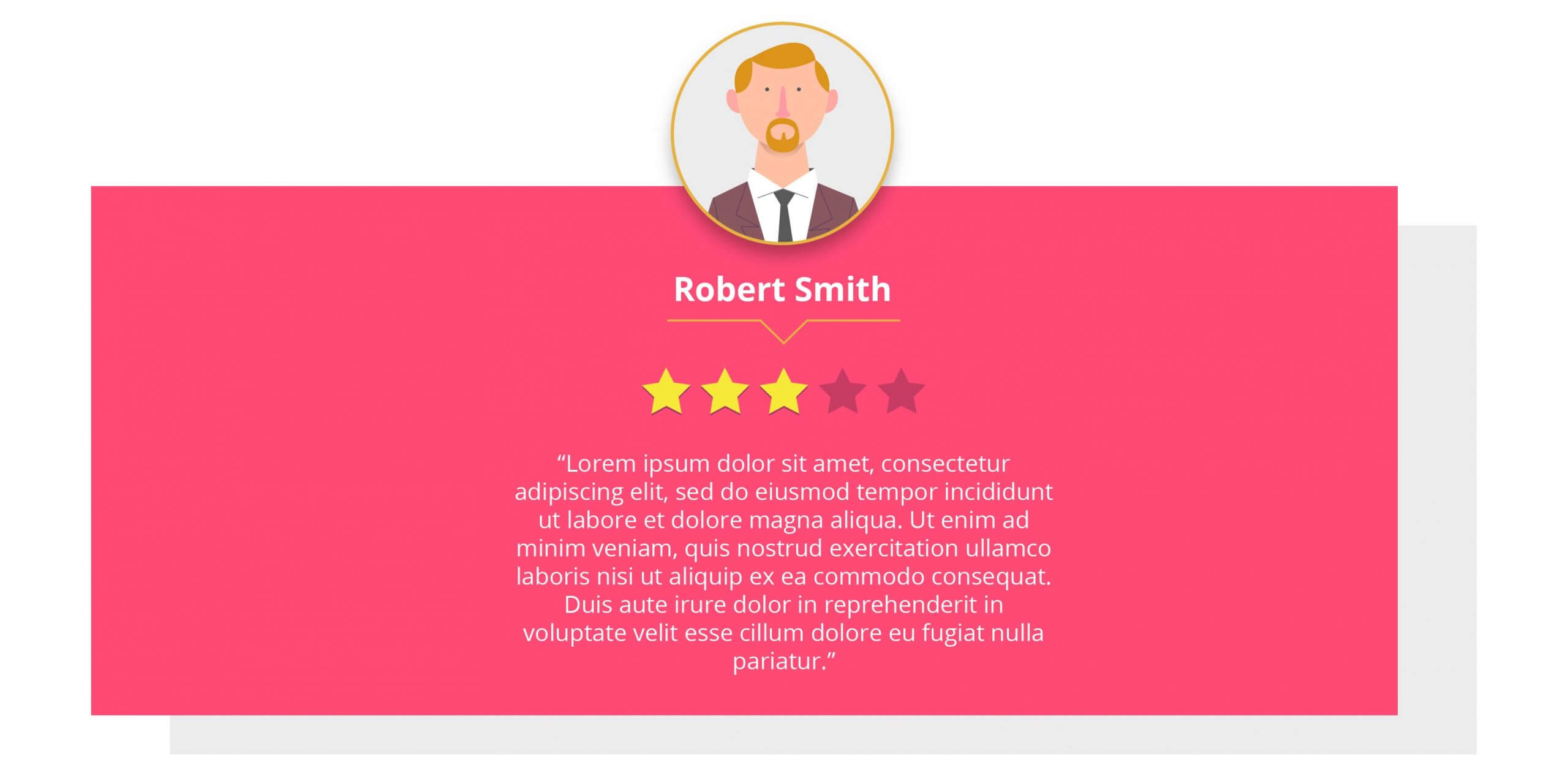
WOW your potential prospects with the favourable comments you received from your satisfied clients. By adding testimonials and showcasing your detailed success stories, you can display how your products or services help people. By adding these essentials, your business would ultimately look more valuable and believable. Your potential prospects will now have more reasons to trust you.
We suggest that you show appreciation to customers who drop an online review or recommend your business by word of mouth, by offering them merchandise of your brand or free coffee. This will improve customer relationships.
You can make use of some platforms to collect testimonials & reviews. They are trustable reviews that require the reviewer to log in to their social media profile. Sometimes these platforms may offer you a badge for standing out from your competitors.
When writing a review, you can encourage your customers to mention the staff that have provided excellent service to them. And with that, you can show appreciation to the staff with the most reviews. Also, from a customer’s perspective, when a customer includes the person’s name in their review, it means the review is genuine and the service given was personal.
These are the platforms you can collect testimonials from:
- Meta
- Google My Business
- Disqus
- Yelp
- Trip advisor
- Amazon
- Third Party Marketplace (Lazada/Shopee/Grab)
- Glassdoor
- Dianping
- Newsletters or Review form from Your Own Website
However, these platforms are for reference only. There are different platforms available for different types of industries. Each country has its own local directories for reviews and recommendations. If you would like to find out, the best way to do this is to browse the websites of your competitors and see where they are collecting their reviews from.
7. Updated Copyright
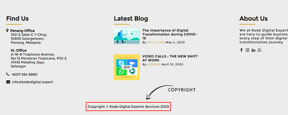
Do not neglect to update the copyright year located in the footer of your website. It may seem like a small issue, but an old copyright year surely does say that your company is not on top of the business game.
Be sure to update your copyright year as this little sign does show your potential prospect that your business matters and is constantly up to date.
You can tell your developer to set it to automatically update it every year so you don’t have to bother them to update it for you every year.
On a side note, regulations may change every year. You can also update your website terms & conditions and policies to match the current situation.
In a nutshell
We hope the above guidelines can help you improve your website traffic.
Try to catch your visitor’s attention within 3 seconds and make them stay longer on your website. Include a ‘summary’ at the top of the home page, to let your audience know what you are selling, why they need to stay on this website to find out more and why you stand out.
Nurture your customers by collecting their contact information, asking about their recent shopping experience, sharing with them the latest updates of your company, make them feel exclusive.
At the end of the day, humans have feelings. And if you are a customer, you don’t want to be buying from a robot, do you? Apart from excellent products, customers always value personalised service. Without good service, it will be harder to get more referrals from the existing customers.
Be sure to keep track of the analytics of your website regularly to monitor the trend and to ensure that the bounce rate and exit rate is reduced. You can also write blogs to engage with your customers. The more you share, the more visible you will be on the search engine.
As a Meta Business Partner, Kode Digital has access to exclusive tools and resources that can help our clients get the most out of Meta’s platforms. Our team stays up-to-date on the latest Meta marketing trends and best practices. If you already have a website but are having trouble reducing the bounce rate, speak to us today and see how we can enhance your website and run digital marketing campaigns to boost your website traffic.


