Our top-tier consultancy services provide strategic guidance to elevate your entire digital presence.
Learn More
 " />
" />
 " />
" />
 Sze Khun Lim
|
December 23, 2022
|
Design, Website Design & Development
Sze Khun Lim
|
December 23, 2022
|
Design, Website Design & Development
Contents
If you want your website to stand out, one thing it absolutely needs is a memorable design style and aesthetic that leaves an impression on website visitors. With so many sites and web pages in so many different designs and styles, it can be a challenge to make your website stand out, but it is necessary to improve your site’s chances of retaining visitors.
The sky’s the limit when it comes to website design, but for most, it may be easier to follow a specific design style that works for them. These are some of the most popular design styles and themes to achieve a modern, clean website design for any type of website.
Aside from website designs and concepts, you need to be aware of the essentials of a website’s elements if you’re running a business. Without these, your efforts will go to waste. Keeping these
essential elements for business website in mind would help you cater to your target demographic, and help your business thrive.
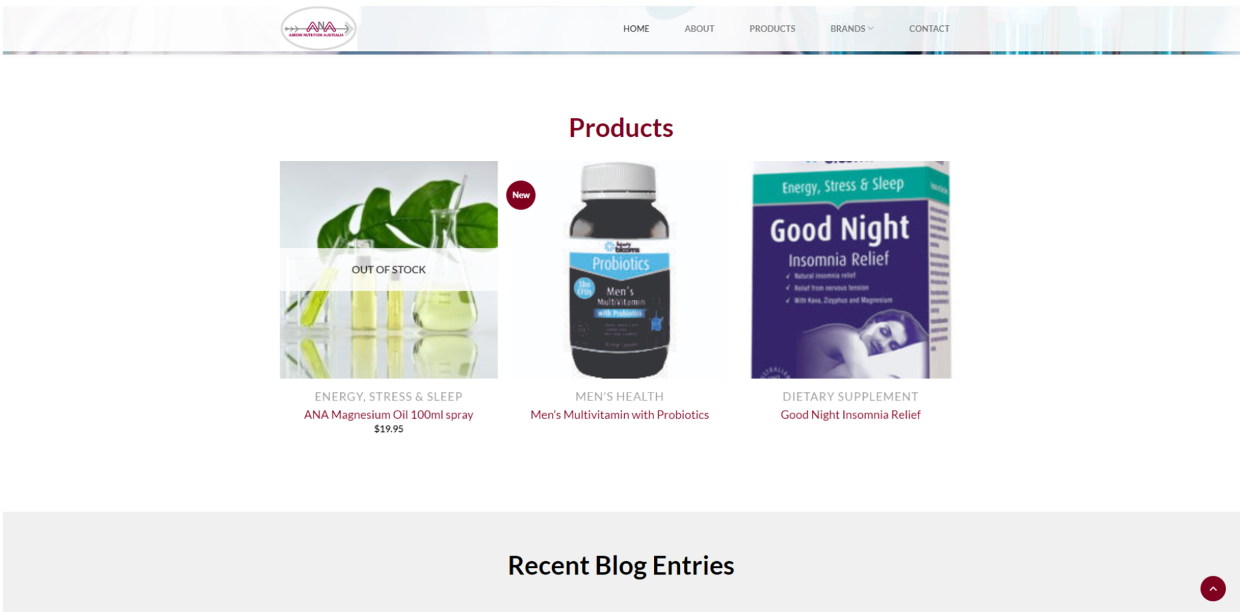
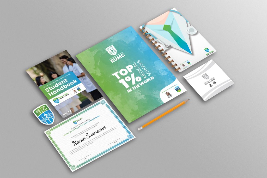
Website homepage for Arrow Nutrition Australia, a pharmaceutical company
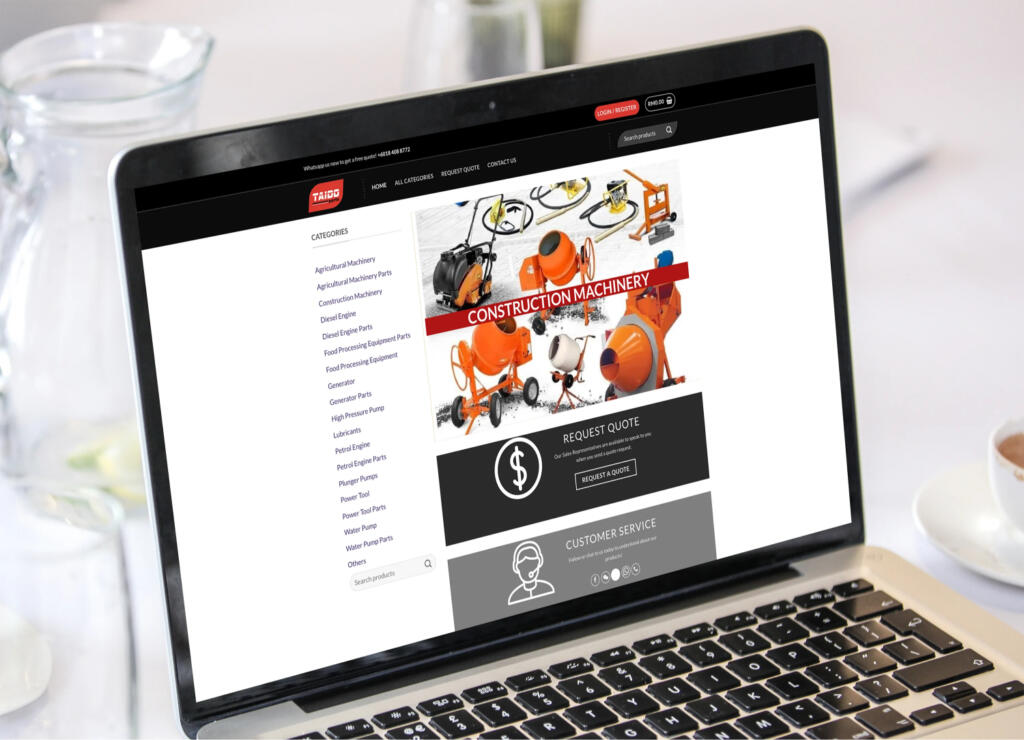
As a concept, realism is exactly what it sounds like: good website designs that declare its intention and its service. Realism-style websites borrow visual and functional elements from the design of the business and the services it provides.
The design principles of this website style are:
This design accurately depicts the business or service in order to create a realistic expectation of the service provided. As such, browsing a website designed for realism often gives an idea of what the business’s physical location will look like.
This style is often used for websites that provide a physical product or service, and want to give their customers a clear representation of what they are selling. A common theme for websites that adopt realism is using colours featured in the physical store and brand identity, as well as actual images of their products. Though this limits designer freedom with the website, it helps get the site’s point across and can still be adapted in creative ways.

Website Homepage for Joint & Spine Chiropractic Clinic
A variation on minimalism, the flat aesthetic often involves simplified, modern designs and decorations that, while lacking a defining look on their own, create visually-pleasing designs when carefully arranged. This includes simple, smoothened shapes with flat colours or patterns to create simple background and foreground elements.
Flat design was developed to make websites and mobile apps highly responsive. It accomplishes this by doing the following:
The advantage of this art style is that it is simple to adapt and infinitely variable, able to be redesigned and improved to fit any website needs. This makes it easy to create and change to make a website with elements and designs that stick with users and make it easy to navigate and identify.

Similar to flat designs, geometric website designs are characterised by the angular shapes and lines of their website features. This style captures the essence of modern simplicity with its geometric shapes and patterns in order to distribute content and establish an order of content importance.
When creating geometric website designs, these are a few things to keep in mind:
While not specific to any type of website, the geometric design is often best paired with websites that intend to display a combination of images and descriptive text, sacrificing precious space in order to establish defining lines and borders between focal points. These include retail and electronics websites, where product visuals are just as important as website layout. By defining the elements of a webpage by the shape they fit into, it conveys a clear understanding of what the web designer wants visitors to see when they open the webpage.

The Happy Human Hub Homepage, an NDIS provider
When it comes to using typography as a design aesthetic, the key is to use the differences in font styles and sizes to create visual structure. Websites that use typography do not try to display as much information as possible, but rather design the most important text in a way that grabs attention; changing its style to stand out and enhance its viewing prominence. In some cases, it may even be better to minimise the amount of text on-screen at any one time in order to keep website navigation clear.
Reminiscent of archaic print media, such as early black-and-white newspapers, typography can still be used to great effect in website design to put the information you want in front of site visitors in order to remove the potential distractions of images and bright visual elements.
Though there are no right answers when it comes to typographic website design, here are a few tips that make your website more visually pleasing:
Favoured due to its simplicity and pre-defined hierarchy, typography based websites, if done correctly, bring harmony to readers. Better yet, cater your website to dyslexic. Check out this article for website design for readability.

Homepage for Kazan Dessert, by The Volcano
Sometimes, the best designs require a touch of personality to them. This is an underlying belief with freehand website designs, as it can help a website to stand out by following the design principles that best fits the business’s aesthetic. While still obeying conventional design principles and rules, freehand as a style is characterised by art and designs that bring out the personality of a business. As such, the layout and design does not follow any particular pattern but instead relates to the design that best depicts the business. In most cases, simple designs are better in order to keep the site’s design uncomplicated and to ensure visitors know what to look for.
The purpose of this design is to give the website a personal touch while also focusing on its content. As a side effect of its philosophy, this design is best suited for small or privately-owned businesses aiming to stand out in the crowd. Though often challenging to pull off, freehand websites are some of the most visually outstanding and memorable.
Though these popular designs help a website to be more visually pleasing, this does not guarantee the website’s style will stand out or be memorable to site visitors. Instead, it is important for website designers to build upon the basis and principles of these designs in order to develop an individual design aesthetic, unique from other websites that share the same style. These additions and changes are different for every website and can take many forms, including elements like motion graphics, unorthodox patterns and variable page layouts.
Developing your website’s design style is not only essential to make a stand-out website, but also forms the basis of a better understanding of website leads and content optimisation.
This can help improve a website’s conversion rate and improve the efficiency of an online business. To achieve the best design possible, it is recommended to consult a professional designer who can offer insights and opinions of how to best add to your website design.
For more website design features and trends, check out this article we’ve written.
353-3 Jalan C. Y. Choy,
10300 Georgetown,
Penang, Malaysia.
A-16-8 Tropicana Avenue,
No 12 Persiaran
Tropicana, PJU 3, 47410
Petaling Jaya, Selangor.